Documentation
The Magazine
Music and Maps Magazine is a digital magazine dedicated to music and its various facets. The magazine currently contains three issues, dedicated to three variations on the music theme: music and technology, music and contexts, and music and fashion. For each issue there are three articles related to the theme that have been selected from authoritative online publications and whose authors and all related metadata are given. The issues were thus divided among the three developers of the project:
- Erica Andreose: Music and Techonologies
- Chiara Parravicini: Music and Context
- Gaia Ortona: Music and Fashion
Music and Maps Magazine allows you to vary the typographic, graphic, and aural appearance of the site as you explore the articles. The style variations are devoted to 6 different historical periods: 1500, 1800, 1930, 1970, 2000, 2030. Each historical period takes specific references and adapts the layout style of the articles to them. The css styles were thus divided among the three developers of the project:
- Erica Andreose: 1550 and 2000
- Chiara Parravicini: 1800 and 1970
- Gaia Ortona: 1930 and 2000
The Vinyl
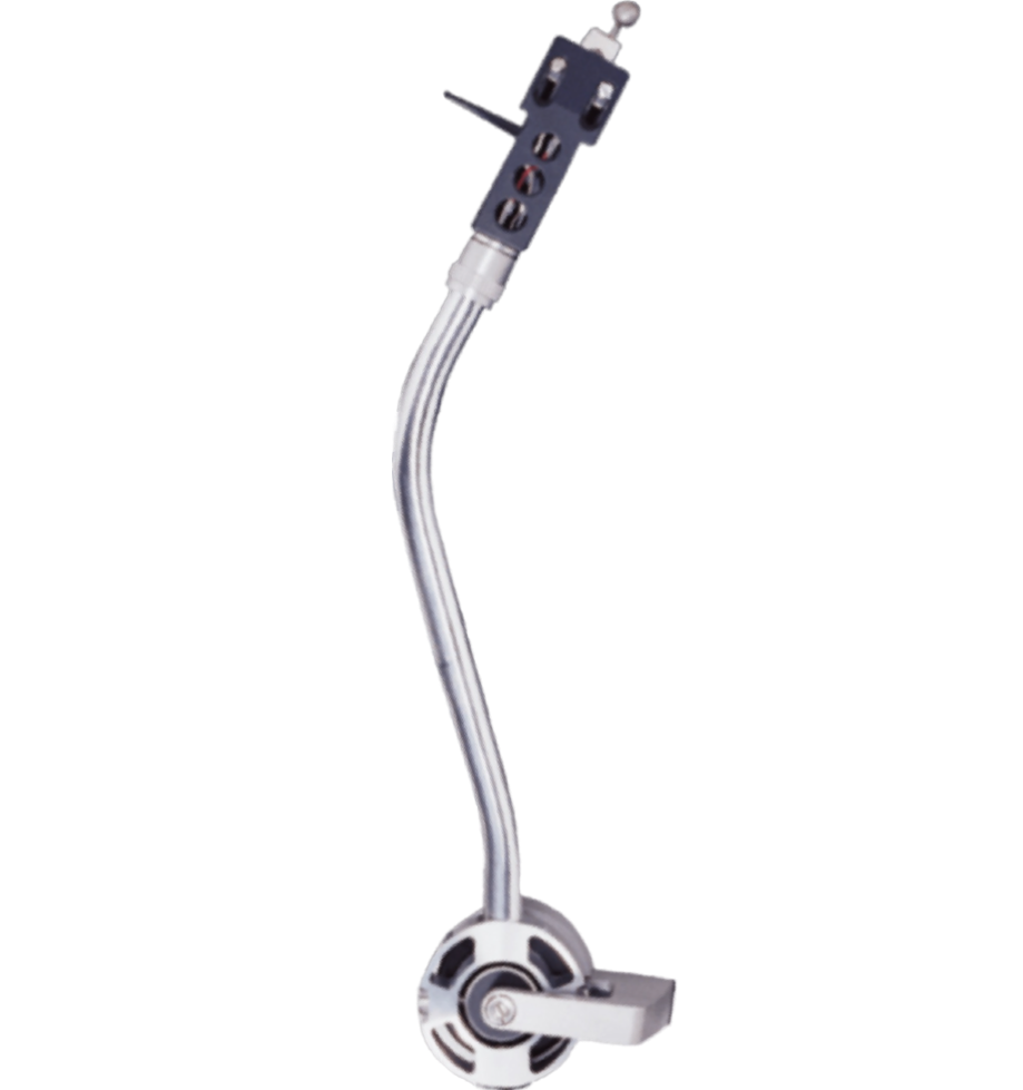
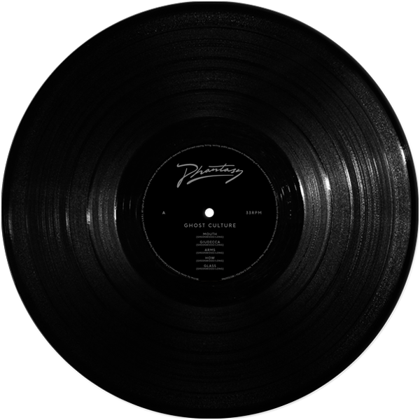
Given the theme chosen for the magazine, we thought of rotating (metaphorically and literally) the pages of our website around the presence of a digital record player that offers different tracks and records for each style. This will allow the user to experience a greater degree of immersion in the reading experience. The vinyl record player consists of: an arm that raises and lowers each time the music player is started or stopped a disc that rotates of 365 degrees with a constant speed a player that handles music start and play, buttons to navigate back and forth through the song list, and an upper string where song titles are displayed.
1500 - Books of Hours and the advent of incunabula
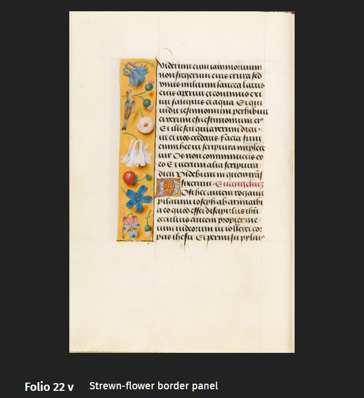
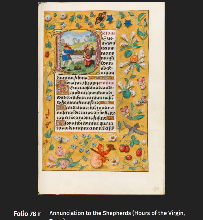
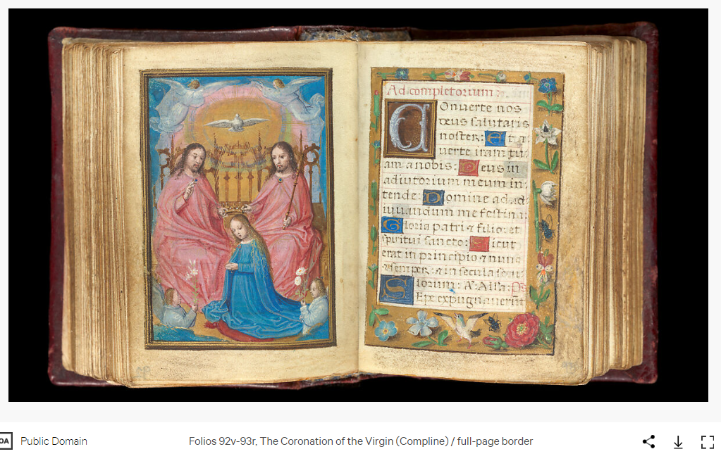
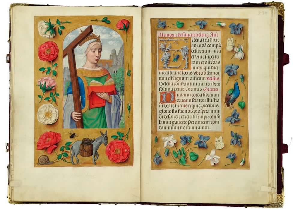
For the 1500 style, I have decided to focus on a precise textual type that sees its greatest rise and demise precisely between the late 15th century and the first part of the 16th, I am talking about the Book of Hours. A devotional text that encompasses prayers and psalms as an abbreviated form of the breviary, containing the canonical Hours recited in monasteries. It also marks the canonical feasts of the saints and the succession of Christian devotional time. With the arrival of printing at the end of the 15th century books there was a great revolution that sparked enormous changes in how books were made and disseminated. Great changes that also affected patrons. Now that getting a book of hours had become easier and cheaper, even the less affluent classes could afford and access prayer books. This is precisely why the elite and wealthy class must make up for the ascendant accessibility of the book of hours with increasingly rare and expensive private commissions. Books of Hours made on commission in the 16th century are in fact luxury texts for private devotion containing illustrations and decorations that reach the highest heights of realism and richness. Nobles demanded the creation of works that would then be passed down through the family as a symbol of unparalleled power and devotion. For miniatures and decorations, simple scribes are no longer hired but real painters and artists who generally work on full-size canvas. Some examples I have used as visual references of the chosen style are:
- Book of hours of Flanders, MS 1058-1975, c.1510-1520 (from which I borrowed some floral decorations for the layout of the text area)
- The Rothschild Prayerbook, Ghent or Bruges, c.1505-1510
- Floreal Book of Hours,ca. 1530–35
Typographic style
The layout I have chosen to follow has narrow margins of 23vh for the left and right lado that force the text into a justified central column, to recall the arrangement of manuscript writing within the illuminated side decorations that in my case recall the rich three-dimensionally illusory illustration with flowers and small animals that appear to be resting on top of a sheet of gold. These images were digitally processed and are the result of a mashup of several images derived from the Book of hours of Flander.
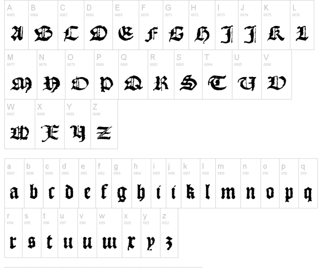
The main font I chose to use is "1492 Square (2008)" created by Gilles Le Corre, a French designer.
This font can be downloaded for free from DaFont and reminded me of the hybrid Gothic bookhand known as bastard, bâtarde or lettre bourguignonne. A style of writing greatly used for luxury manuscripts of that period. Thus, we can say that it is a somewhat "retro" font that wants to maintain the Gothic origins of the manuscript but moves closer and closer to the rigor and breath of the printed setting. These are thus the last glimmers of handwriting before the final abandonment of the copyist's practice. The font, in addition to being extremely precise in the shape of some particular letters such as g, s, and t, also represents well the characteristic of amanuensis writing, in which letters can be extremely strict and neat (so much so that they appear to be printed) but also enclose delightful smudges and spots that recall their human-originated nature.
The line spacing is 2.4rem because it is more reminiscent of that shown in the references, where the text continues by standing very close to the capitals.
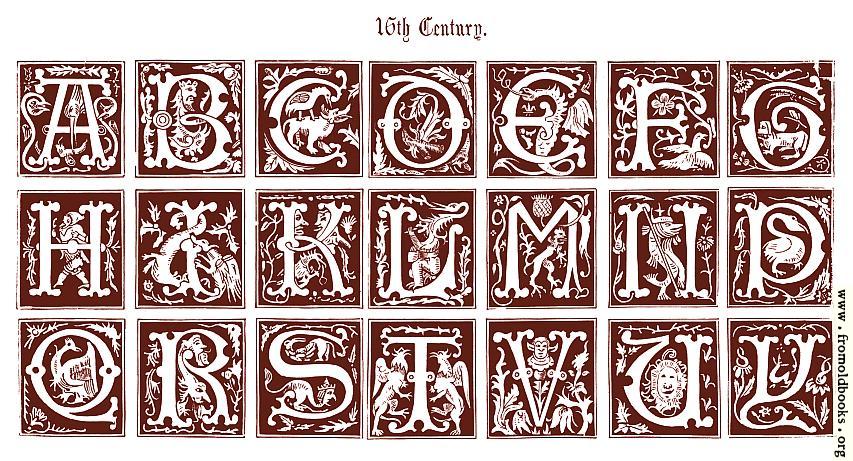
For the letterheads I looked for a font that recalled the rich decorated initials of the period. During my search I came across this site that archives images and decorative alphabets and designs from various eras: https://www.fromoldbooks.org/
Searching the archive, there were some 16th-century alphabets and I found one with ornate initials reminiscent of a future evolution of bastard Gothic (see the letters d, y and q) with decorations inside that recalled medieval bestiaries. I then chose to turn this design into an alphabet using Calligraphr's online portal.
Within the text, through specific divs, other small decorations of flowers or illuminated insects have been inserted that precisely recall the illustrations of the valuable manuscript of the time. The colors selected for the 16th century style were selected from the reference images and are: Seal Brown for the text, with some words highlighted in Dark Blue, Raw Umber, Maroon and Fun Green.
The mouse cursor is replaced by a manicula reminiscent of the decorations that copyists inserted at the edges of text in manuscripts to signal an oversight or a paragraph to be linked to another. In the 19th century the manicule became a popular typographic symbol. Today, the manicule is a standard typographic symbol intended to draw the reader’s attention to important text.
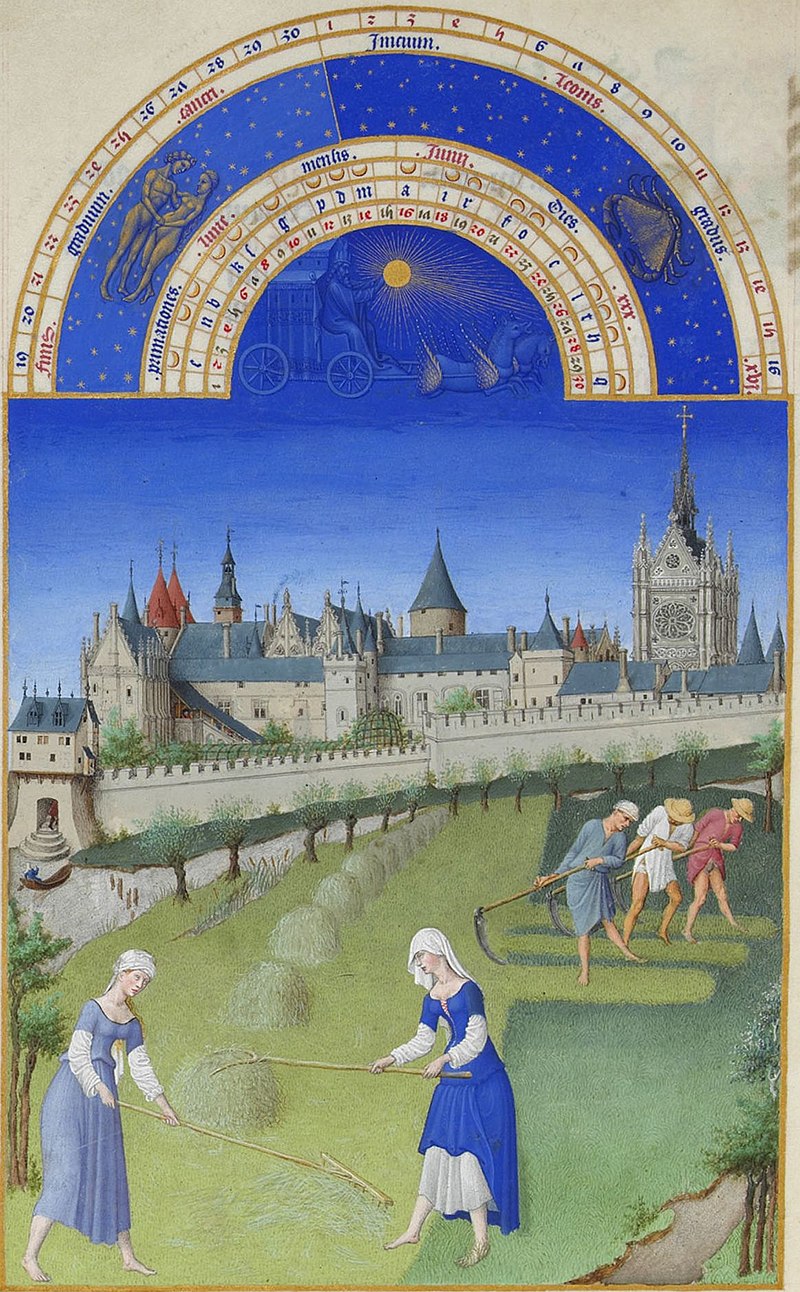
The vinyl retains its function but changes disc and loads a zodiac drawing by Battista Agnese, a 16th-century Italian cartographer. The zodiac and the scanning of time and the celestial sphere through months and signs is an extremely present feature of the historical period. The wealthy class especially was very much connected to astrology and the study of the position of the stars. This particular detail also recalls the layout of another very famous book of hours, namely the one illustrated by the Limbourg Brothers for the Duc de Berry.
The map also changes style to match the reporting period. For this I worked an existing prototype on MapBox Studio, making changes to match the colors to my palette to align the fonts used and symbols as closely as possible.
References
https://www.metmuseum.org/toah/hd/hour/hd_hour.htm
https://www.abebooks.com/books/rarebooks/explaining-books-of-hours
https://www.textmanuscripts.com/blog/entry/03-22-margins-the-limit-of-the-text
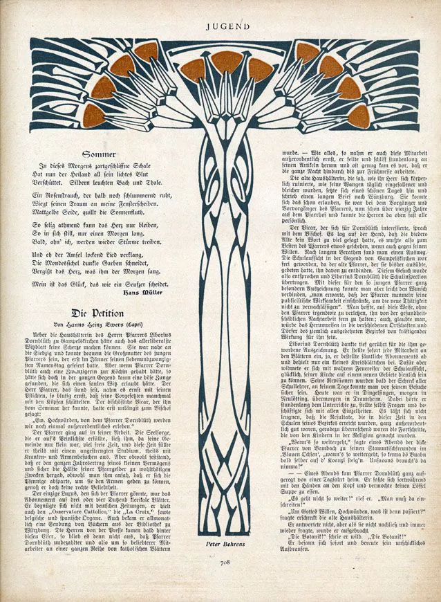
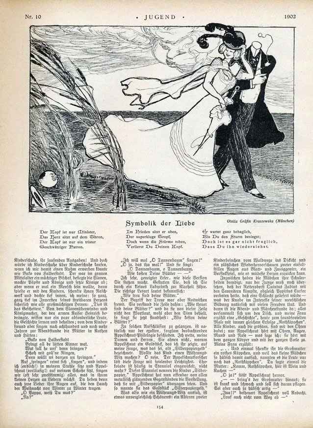
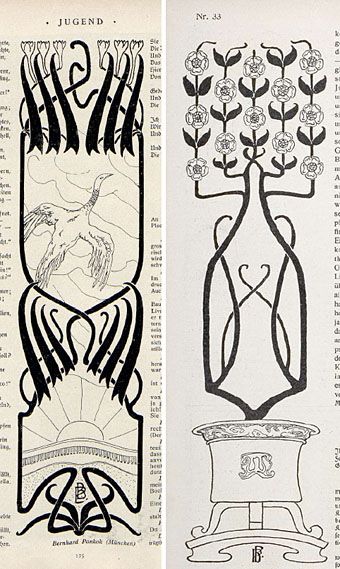
1800 - Jugend Magazine and Jugendstil
The reference I used to ideate the layout of the 19th century inspired style is the Jugend magazine. Jugend magazine, founded in Munich in 1896 by Georg Hirth and active until 1940, played a pivotal role in shaping the German Jugendstil movement, a local variant of the international Art Nouveau. The magazine aimed to showcase German Arts and Crafts initially but gained fame for championing the German Art Nouveau style, eventually giving rise to the Jugendstil movement. With weekly publications, Jugend captured the contemporary zeitgeist through texts and sumptuous illustrations, presenting art as a natural and essential component of life.
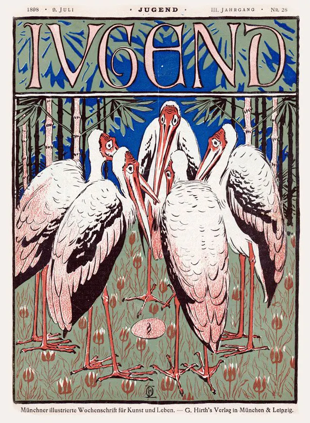
Jugend's visual style evolved with the emergence of Jugendstil, characterized by its two-dimensional designs featuring dynamic linework inspired by nature. The movement's artists, including Otto Eckmann, Hans Christiansen, Gertrud Kleinhempel, and others, showcased their versatility across various disciplines, from paintings and furniture to typography. The magazine played a crucial role in the graphic industry's development, benefiting from technological advances in printing that enabled high-quality reproductions of contemporary art. Jugend's impact extended beyond graphic design, influencing architecture and applied arts, contributing to the broader German Jugendstil movement and later merging with the Bauhaus tradition.
Typographic style
For the layout, I opted to emulate a specific page from the Jugend magazine, curated by designer Peter Behrens. I recreated the decorative "T" element that divides the text into two columns, separating the horizontal portion from the vertical one of the illustration. I extended this approach to cover the entire length of the articles. The Alte Schwabacher font is the closest reproduction I found of the original magazine page's font, serving as my reference. It exemplifies the Art Nouveau's penchant for Gothic-medieval style and, notably, reflects Jugend magazine's commitment to reproducing a non-manufactured aesthetic with a calligraphic touch.
Maintaining a layout congruent with the reference, I centered the titles, utilized wide margins, and adopted a narrow line spacing. The vinyl element, typically found in Jugend, was replaced with a circular motif from the Czech artist Alfons Mucha, a significant figure in the Art Nouveau movement.
The color palette employed for the text, links, and map refers to the characteristic nuances of the decorative elements, establishing a cohesive visual connection throughout the design.
References
https://www.vitimusea.no/en/kunnskap/jugend-en
https://digi.ub.uni-heidelberg.de/diglit/jugend1896_1/0100/image,info,thumbs
https://musemarketinggroup.ca/design/resurgence-of-art-nouveau-typography/
1930: Vogue Archive
Vogue stands as an iconic and widely recognized fashion magazine that has left a lasting impact on various aspects of our daily lives. Originating in New York in 1892 under the editorial direction of Arthur Baldwin Turnure, the publication later came under the ownership of the Condé Nast group, a relationship that persists to this day. Over the years, Vogue has expanded its influence globally, evolving from a weekly newspaper into a platform that delivers compelling and niche articles. Notably, it has become renowned for its unforgettable covers, which have emerged as a distinctive hallmark. In pop culture, Vogue's presence is not only acknowledged but also celebrated, solidifying its enduring significance across different countries and eras.
Considering that the issue under my purview pertains to the realm of fashion, it seemed highly pertinent to draw inspiration from this illustrious journal.
The impetus for the 1930s style emanates from an edition of Vogue released on October 13th, 1930, which is conveniently accessible in the Vogue archive online (https://archive.vogue.com/issues/1930). Commencing with the presented cover, depicted below:
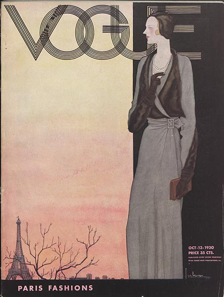
I replicated the page layout by splitting the canvas and implementing a linear gradient on the left segment. Subsequently, I incorporated a stylized full-length depiction of a woman on the left-hand side.
Concerning the fonts, the typeface employed for the titles of my articles ("Monoton regular") mirrors that featured on the cover. I opted not to replicate the chromatic scale of the cover, as, for the design of the remainder of the page, I favored drawing inspiration from the internal contents of the magazine.
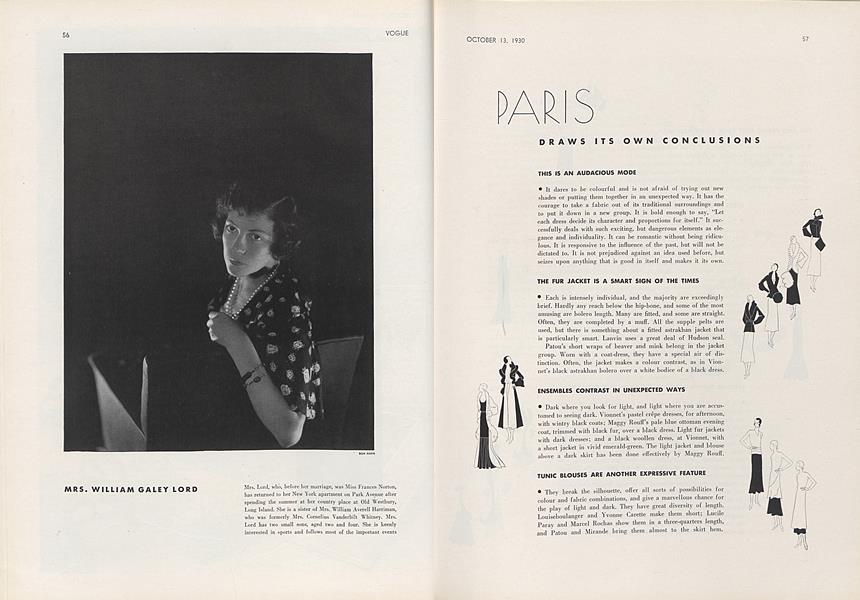
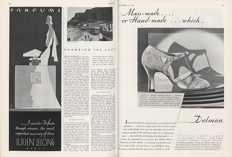
As depicted in the reference images above, I have incorporated the internal characteristics of the magazine by arranging the article into two columns and justifying the text. Additionally, a sepia-toned color filter has been applied to the images to evoke a black and white effect. The fonts employed for the remaining text include Josefin Sans, Becker Black, and Semplicita Light.
Regarding the vinyl image, I have chosen a picture inspired by the aesthetic of 1930s newspapers. The selected song is "Parlami d'amore Mariù," written by Ennio Neri and published in 1932.
The color palette that i used con be seen below:
References
https://archive.vogue.com/issues/1930
1970 - Disco 45 Magazine
For the Seventies-inspired style, I was inspired by the layout of the magazine Discco 45.
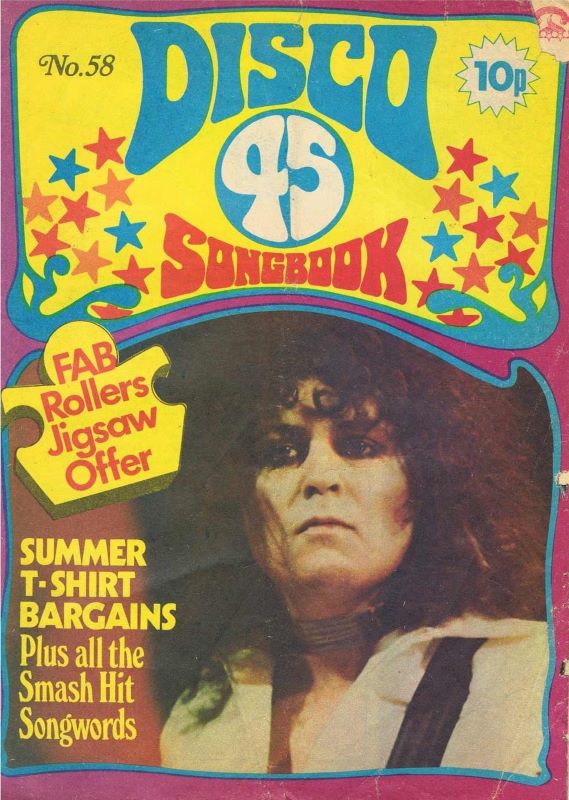
Disco 45, a monthly music magazine in the United Kingdom that ran from 1970 to 1983, gained prominence for its distinctive focus on printing the lyrics of contemporary pop songs with a vibrant and colorful layout. Published by the Trevor Bolton Partnership in Rye, Sussex, the magazine's inaugural issue in November 1970 showcased Mick Jagger on the cover and featured lyrics from artists like Jimmy Ruffin, Cat Stevens, and Stevie Wonder.
The magazine underwent a transformation, rebranding as Disco 45 Songbook, and concluded its run in July 1983 after producing 153 issues. A notable aspect of Disco 45 was its engagement with readers through small ads, initially focusing on 45 RPM records.
Typographic style
For the layout, I drew inspiration from various pages of the magazine, combining the most distinctive elements from each. The fonts used for titles, navbar, and metadata boxes (Tabasco, Stilla Script, Jimi, Boogaloo Avenue NF) were selected from different magazine covers. The CG Times font closely replicates that used for the body of the magazine articles. Opting for two columns instead of three, as seen in many original examples, was a choice driven by considerations of readability and the overall width of the article space within our site's structure. The justified text, font size, and relatively tight line spacing align with the layout choices of the reference.
Vibrant and contrasting background colors were chosen. The article text is framed, echoing the style seen in many magazine texts. Images and tables feature decorated borders and backgrounds with colors contrasting those of the article, mirroring the approach often taken for photographs or special paragraphs in the magazine. Titles and tables are subtly rotated to capture the dynamic layout characteristic of Disco 45 Magazine. The vinyl, in this instance, is directly inspired by the magazine's logo illustration, reminiscent of a 45 RPM record. The music box replicates the distinctive label containing the title on the Disco 45 Album Page.
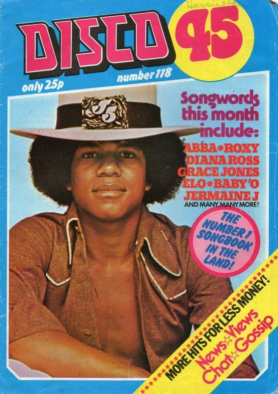
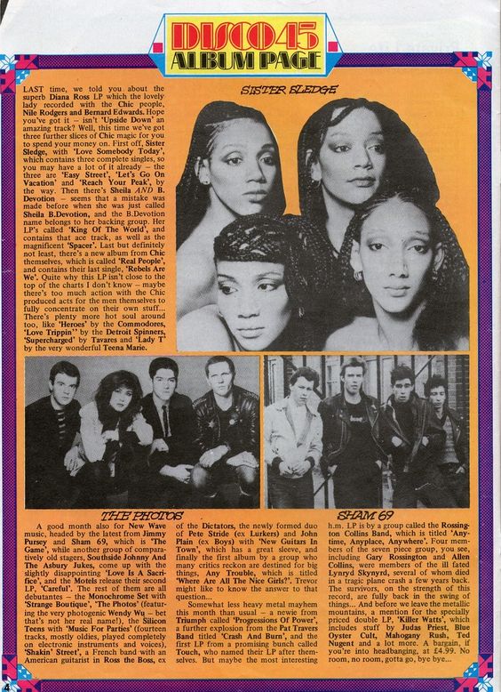
To top it off, an SVG animation in the top-right corner reflects the striped aesthetic typical of 1970s layouts. The article palette directly mirrors the magazine's most distinctive and vibrant colors, that were extracted with a specific tool directly from the reference images.
References
https://djleekee.wordpress.com/2012/09/30/retro-disco-45-magazine/
https://en.wikipedia.org/wiki/Disco_45
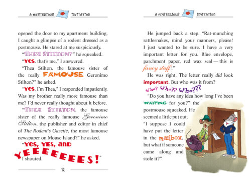
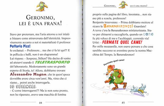
2000 - Geronimo Stilton
I've chosen to draw inspiration from children's publishing for the 2000s style. Because I grew up in the 2000s and was a big reader, I vividly remember that some of my favorite books from that period were Geronimo Stilton books. Geronimo Stilton is a fictional character who is the protagonist of a children's book series written by Elisabetta Dami. The series, called "Geronimo Stilton," is known for its fun and interactive storytelling style, with colorful text and varying fonts to emphasize certain words or phrases. The series is aimed primarily at a young or very young readership and has gained popularity for its combination of engaging stories and attractive visual elements.
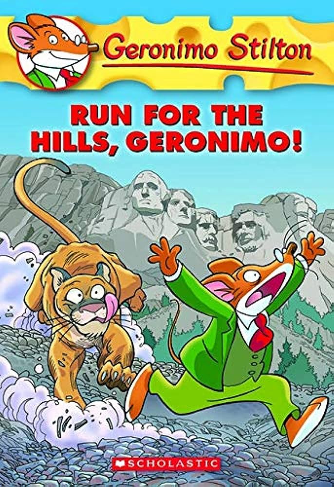
For the vinyl, I turned it into a delicious cheese round. The accompanying song is the theme song of the Geronimo Stilton cartoon. same for the mouse cursor that becomes a slice of emmental cheese.
The style of the titles is OpenSans ExtraBold which is taken directly from the covers of the classic book series, as well as the typical bright red color and black shading that creates three-dimensionality. The font of the text is LifeLTStd-Roman, with a size of 1.8em, to which I added a line spacing of 2.0em to make the width of the text similar to the original books where the spaces are airy and the letters very large, to allow easier reading for younger children. Paragraph headings also retain the same font. A choice I made based on the classic texts in the Geronimo Stilton series, where the chapters maintain the LifeLTStd-Roman but all in capital letters, so I added an "uppercase." Of course, the most iconic feature of Geronimo books is the variegated transformation of fonts that adapt to the many words in the text and give them "life" through design and color. To do this, I operated through spans that were inserted into the htmls of the articles in correspondence with the names of people, places, and keywords. For the keywords I went even deeper by going to select the ids of each word to align it with one's font style. The selected fonts try to match the word represented as closely as possible. For example: the word "music" is transformed with a font that contains a pentagram with notes while the word "dataset" has a futuristic font reminiscent of Back to the Future and so on. Here, too, are decorations within the text that refer to the illustrations in the books.
Mapbox map was customized directly by me with mapbox studio. I tried to create a colorful map, reminiscent of the style of book illustrations and reminiscent of giant cheese wheels from a distance. Even the fonts are aligned with this playful and cute style.
this is the color palette used:
They recall the main colors of the typical elements of the novels in the series, the yellow of the cheese, the contrasting blue, the red and green of Geronimo's outfit.
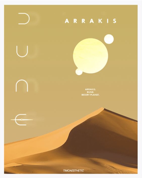
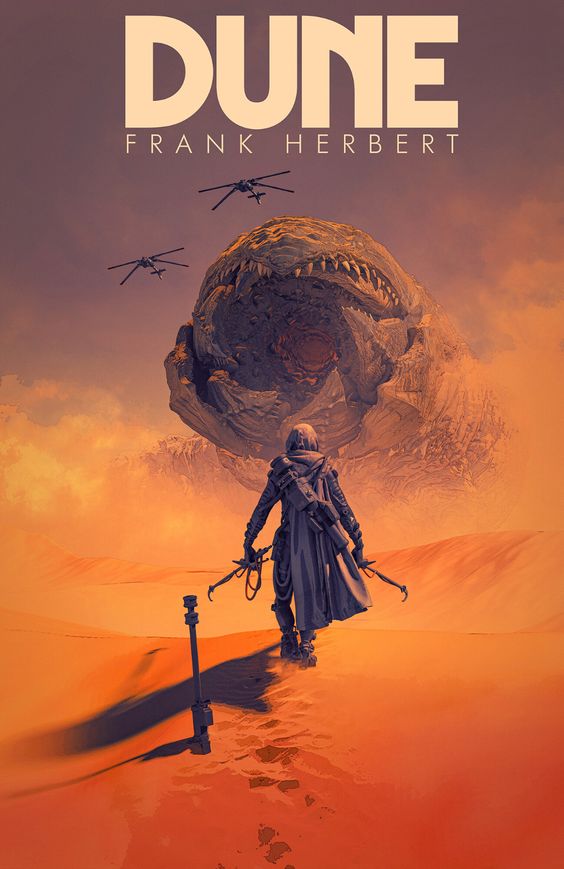
2030: Dune aestethic
As for the futuristic style, I have chosen to draw inspiration from the science fiction series 'Dune,' created by the writer Frank Herbert and adapted over the years for the big screen.
The saga is set in a distant dystopian future on a planet called Arrakis, also known as 'Dune.' This entirely sandy planet is the sole source of the universe's most precious substance, the 'spice': a psychedelic substance resembling a glittering powder found in the sands covering the planet. The spice grants the gift of precognition and enhances mental abilities, enabling the use of machinery for interstellar travel.
I have recreated the desert atmosphere through a specific color palette:
The colors from this palette have been employed in the body and echoed in the animation featured in the footer.
As for the font, I have chosen to use 'Bungee Hairline Regular' because it perfectly recalls the font used in the cinematic product graphics and aligns seamlessly with the futuristic atmosphere.
.jpg)
I wanted to create a miniature version of the planet Arrakis to include within the project, and I decided to achieve this by utilizing the mouse cursor that mimics the features of the sandy planet.
As for the vinyl, I have once again chosen to select a reproduction of Dune with sandy tones to further convey a sense of aridity and decadence. The song included in the box is taken from the film's soundtrack, entirely composed by Hans Zimmer.